Friday, April 28, 2017

Olathe Northwest SQUIRRELS

If Olathe Northwest changed their logo from ravens to something else, I would want it to be the squirrels. This is because squirrels are terrific. First of all, they are incredibly adorable, but beneath their cute appearance, they are vicious, deadly critters. They are swift, competitive, and intimidating creatures. These are all components of a good mascot.

The creation of my squirrel mascot is going decently so far. I wanted to make the squirrel look cute as well as vicious. I achieved this by using the pen tool in adobe illustrator to vector a clipart image of a squirrel. After doing this, I created the body and tail. I made the tail protrude form the back of the squirrel. Next, I found a swirly font that I thought would work well as a school font. I typed Northwest squirrels on and above the tail.

with words
just icon
Now it's time for color! I wanted my color scheme to look clean and look well together, so I chose a complimentary color scheme of orange and blue. I think this color scheme looks very good.


colored squirrel head

colored squirrel with words


Now that I had the squirrel, it was time to make the actual website. We just made the home page with a bunch of fake links. I incorporated the orange and blue color scheme togo with the colors of the mascot. I used a web template, so it was very easy. All I had to do was put in the content. Because it is a template, it came with responsive design. There is a cool image that moves as you scroll. This image disappears when the screen size is a certain size. This is how it turned out:


Check it out here.

Wednesday, April 19, 2017

Updated Index Page

We thought that our web index pages that displayed our web work needed a facelift. To redo my index page, I used a web template provided my Dream Weaver. This template looked very professional, clean, and was complete. All I had to do was insert all of my content and create a color scheme. This made creating a website much faster and look much more professional.

This is what my web index page looked like before the makeover. I designed it by myself (with out a web template). I liked the color scheme that I had before, so I tried to incorporate a similar one in my new index page.


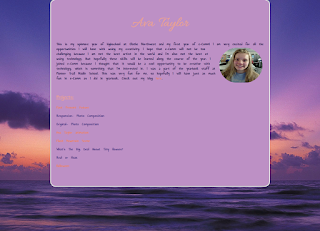
This is what my updated index page looks like. It has a similar color scheme as my old index page, but I did not set a photo as the background in the new one. A big difference is the layout. Each website displayed is inside a thumbnail. In addition, each website has a short description of what the website is about. To check out the website, instead of clicking on a boring text link, a screen shot of the website is the link. Another different in the new index page is the "Email" button at the bottom that allows someone to click it and it takes the person directly to my email.

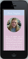
 The web template has responsive design incorporated into it. This made it extremely simple to have a website that would look good at any device size. This is how the layout was spaced out on a cell phone. Something I like about it is how each thumbnail occupies the whole screen as seen to the right. This looks very clean and makes content simple to read. This is what my index page looks like on an iPhone 5.


Creating a website from a template is very beneficial. It is much faster, easier, professional looking, and versatile. However, it isn't guaranteed that the website will be perfect. For example, the layout had a problem at a certain screen size that jumbled up the thumbnails. I couldn't figure out how to completely fix this. In addition, following a web template guarantees that there is another website that looks very similar. This is bad because originality is important, and it's boring for many people to have the same website. However, you can always change the CSS and HTML to personalize it.

I doubt that many web designers create websites completely from scratch because it is much more efficient to adjust certain aspects rather than starting everything from scratch.

Check out my new index page here.

Friday, April 7, 2017

Past Present Future Website

In web design, we made a website that is totally different than any we have ever made before. It is a website, but it has a div that looks like a cool TV and animated text. This was an animated layout that we created in Photoshop. When I saw what the website was going to look like, I thought that it looked really complex, and I didn't think that I could pull it off, but it was actually quite simple.

original
original layers
First, we created the layout in Photoshop. I wanted mine to have a cool galaxy background because when I think of time travelling, I think of outerspace. I, next, typed out my name in a big font and gave it a shadow. I wish I had chosen a cooler font. I did the same with the words Past, Present, and Future. I also added the big "screen" in the middle that would depict my information. I rounded the edges and gave it an outerglow to make it stand out. Next, it was on to animating it. In the layers panel I made two rendeitions of the words. One that would be the original, and the other, the one that changed when hovered upon. Next we animated the layers to fade in and out in the time line. Lastly, we made slices of each word and saved the starting one, and the animated one.
changed 
the slices

changed layers


Then it was on to Dream Weaver. I struggled getting my slices on to Dream Weaver. I inserted a roll over image inside a div. This is where I put all of my slices; first the original and then the animated. I then  made an inner-bottom div, which is where I typed in my information for past, present, and future. I also included pictures. I then entered in the code to make a scroll bar. I changed the CSS to make the scroll bar purple to match my color scheme. I learned that I had to work almost entirely from live view because it didn't show up at all how it really looked in design view. I made four different pages in all and linked them all to one another (linking images works the same way as linking text). I am very happy with how my website turned out, and I'm surprised I actually made it work.

Check it out my website here.